Typography: A Brief History on Typefaces and Fonts
Dating back thousands of years ago, hieroglyphics and calligraphy were used to convey thoughts, visions, ideas and words in writing. As a result of the Industrial Revolution, the creation of the printing press and typewriter alluded to the uses of ink and paper to send letters and publish news. The Technology Revolution of the late 20th century brought computers and led to the thousands of types of digital fonts we see today. With an interesting history and its influence on the world as we know it today, typography is an important aspect of marketing, advertising and branding that companies still use today to influence consumer behavior in everything from politics, consumer packaging, news and editorial content.
Blackletter
Before the printing press, books were written by hand and reserved for the elite. As literacy rates increased, so did the demand for books among the middle class. In 1440, Johannes Gutenberg created the first printing press and designed the Blackletter typeface which mimicked the calligraphic handwriting used to write manuscripts before the invention of the printing press. Due to the difficulty of producing books as quickly as there were demands for them, Nicolas Jenson created a Roman typeface that fit more text on a single page for faster setup times. By 1500, to save even more space to improve the efficiency of book printing, Aldus Manutius and Francesco Griffo created the first italic typeface, which to this day is still used to emphasize text on pages.

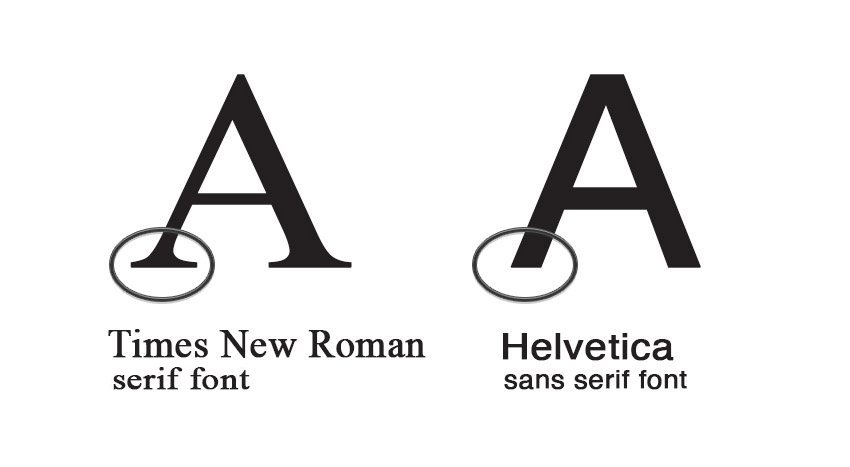
Serif & Sans-Serif
The next couple centuries focused less on printing efficiency and more on legibility of the actual typefaces. Italic fonts were hard to read so Serif fonts became the norm, with small lines at the bottom acting as guides to the reader’s eyes when scanning through text. This font grew in popularity and many children’s books used the font to make reading easier. The next significant development was Sans-Serif, which came a century later due to the influence of Egyptian block lettering. Edward Johnston designed the iconic typeface for the London Underground – which is still in use today.
Courier & Helvetica
In 1956, the Courier font was created by Howard Kettler and released by a computer company called IBM. The company didn’t have ownership of the font, so many other typewriters used it – making it the standard font for computers and in print. Today, actors have a continuous interaction with Courier in their scripts due to the monospacing and thin lines of the font. As words are clearly seen, Courier has become the standard for screenplays. A year later, Max Miedinger created Helvetica, which is one of the most iconic typeface fonts of the 20th century.


Digi Grotesk
In 1968, Rudolf Hell created Digi Grotesk, which became the first digital font, or webfont. The font was not used in computers like we know today, but stored in typesetting machines. These machines had Cathode Ray Tubes that emitted images like an old-time computer screen. The newfound technology of typesetting machines gained popularity and became heavily used in work offices.

Comic Sans
Comic Sans was originally intended to be used in the comic software package, Microsoft Bob — where a cartoon character called Rover the Dog is to aid users through speech text. Vincent Connare, a designer at Microsoft at the time created the font to exude a playful energy to target children who would enjoy the comic. The font was not complete in time for the release of Microsoft Bob, so it was included in the Windows 95 release instead.

Script Fonts
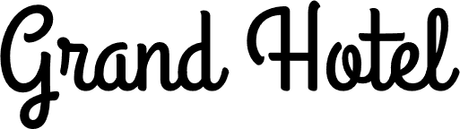
There are many typefaces that fall under script fonts and were made in contrast to the professional printed text that was common at the time. Intended to be digitally designed as handwriting, the purpose was to make written work more personal and authentic. Aloha! Pacifico is an original brush script handwriting font designed by Vernon Adams and inspired by the 1950’s American surf culture in 2011. Another script font is Grand Hotel, designed by Brian J. Bonislawsky and Jim Lyles, and inspired by the 1937 film “Café Metropole.” For writing letters, normal conversations, family recipes and home décor welcome mats, script fonts express an inviting tone. Formal script fonts are also used in sophisticated settings to address people professionally, including on event invitations.

Cursive
Cursive script predates Blackletter and is an elegant type of calligraphy that has now been digitized into typography. American Scribe is one font that was created to replicate the penmanship of Timothy Matlack, who wrote the Declaration of Independence. Cursive became a staple part of schools in the 20th century because of its association with high knowledge and sophistication, which would give students an advantage as adults in the working world.

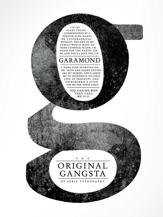
Today, there are thousands of different fonts to choose from, but which one do we like at Grozina? While we work to develop our own font called Grozina, our current preference for print is Garamond, “the original Gangster” and one of the most sustainable fonts to-date.
Named for 16th century Parisian engraver Claude Garamond, Garamond is often used for book printing and body text. The relatively organic structure of the font resembles handwriting with a pen, but with a slightly more structured and upright design. Using less ink in printing, it currently is one of the most sustainable fonts — adopted by the United States government, as recommended by the United States Government Printing Office, to offset costs of printing that is required for legal bodies of work. However, due to Garamond’s difficult legibility in Italics format, the Supreme Court has been using Century Schoolbook for opinions and Lucida Sans Typewriter for orders.
Notes is a collection of articles, analysis, in-depth research and thinking from our firm, published with the purpose of transmitting information, of all kinds, to protect our clients.