CASE STUDY: Refreshing a Family Business Brand for a More Modern Market – Rebranding iRenovations into iBristles
CASE STUDY / Refreshing a Family Business Brand for a More Modern Market – Rebranding iRenovations into iBristles
BACKGROUND
Ignacio Rubiano operated iRenovations, a family-run interior and faux finish painting company based in Palm Beach, Florida. The company had built a loyal client base through years of quality work, specializing in decorative painting, faux finishes, and high-end residential interiors.
Over time, the existing brand identity began to feel outdated and no longer reflected the more modern aesthetic preferences of the market. The name, logo, and overall presentation felt closer to a traditional painting contractor than the elevated look and feel the family wanted for the business moving forward. The decision was made to refresh the brand with a cleaner, more contemporary identity.
CHALLENGE
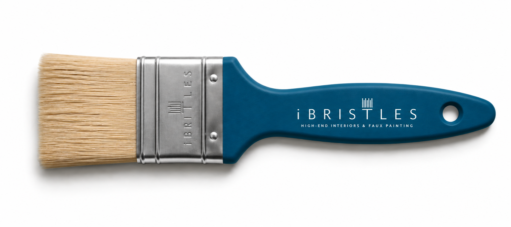
iRenovations had already established a loyal customer base through craftsmanship and long-standing relationships, but the existing brand identity no longer reflected the family’s desired direction for the business. The company sought a refreshed identity that felt more contemporary. The rebrand also presented an opportunity to strengthen brand encoding and improve customer recall. In a market where promotional materials often rely on forgettable items such as pens or generic leave-behinds, a strategic decision was made to develop a custom branded paintbrush tied directly to the company’s trade. Serving as a mnemonic device, the paintbrush created a tactile and visual association between the brand and the act of home improvement itself, reinforcing recognition through repeated exposure and contextual relevance. The objective was to create a more memorable customer touchpoint that increased retention, strengthened brand recall, and established stronger continuity between the company’s identity and the services it provided.
STRATEGIC APPROACH
The focus of the project was modernizing the company’s identity in a way that felt more aligned with current market expectations and the family’s vision for the business.
A new name, iBristles, was developed to create a fresh and more memorable identity while maintaining a connection to the company’s core trade. The visual identity was updated with a cleaner logo, modern typography, and a coastal-inspired color palette reflective of the Palm Beach market and the elevated interiors the company specialized in.
To support brand recognition, marketing materials and branded collateral were redesigned to create a more cohesive and polished customer experience across touchpoints.
EXECUTION HIGHLIGHTS
- Renamed iRenovations to iBristles to create a more modern and memorable identity.
- Designed a refreshed visual identity, including logo, typography, and updated brand colors.
- Developed branded marketing collateral, including a custom paintbrush promotional item tied directly to the company’s trade.
- Updated business materials and customer-facing assets to create a more cohesive and polished look.
- Helped modernize the overall presentation of the company while preserving the reputation already established with long-time clients.
RESULTS AND IMPACT
iRenovations transitioned to iBristles with a new name, updated visual identity, and refreshed customer-facing materials aligned with the family’s desired direction for the business. The rebrand reflected a preference for a cleaner, more contemporary look and feel that moved away from a traditional painting-service appearance and toward a more modern presentation better aligned with evolving market aesthetics. The project included a redesigned logo, revised color palette, updated typography, and branded collateral, alongside updates to marketing materials and business assets to create greater consistency across touchpoints. While the company’s craftsmanship, relationships, and service offerings remained consistent, the refreshed identity introduced a presentation more reflective of how the family envisioned the business moving forward.